Office Planning

Office Planning and Design

There are many people that I have worked with and observed over the years who will endeavour to over complicate design and the process in all aspects, especially the business side of it. These people tend to love forms and document  huge amounts of unnecessary detail. Ideally they are the bureaucrats of our industry and they love to talk and baffle the client with words and lots of paper. I don’t. I am a very strong advocate of the “KISS” method.  Which means – “Keep It Simply Simple” or “Keep It Simple Stupid”. The simpler that the process is the more robust it will be.  Don’t forget the detail but don’t over complicate it. Allow for tolerances in lieu of specifics. As practices grow so will systems and documentation,  always try to alleviate excess. It will save you time and money.

While the design of an office seems simple enough, with basic planning a great deal of consideration must be given to the relationships of people and departments within the office. Space must be allowed for traffic flow, fire and egress and barrier free design or that required for the disabled in our workforce and those visiting the office. However the most important consideration must be for the office worker and space that he or she requires to undertake their work. With office planning  all other spaces and flows must be lead from this and the relationships that each worker has to another.

There are other design factors to be considered for office planning and the interior. Allowance has to be given for services, lighting, ventilation, heating and fire systems, however this article is based on how to space plan and the main ideas behind that. The other items relate to detail which will be addressed in subsequent articles about planning and interior design of commercial offices.

How to Start Office Planning

To make a start the space required must first be determined.  This is done undertaking an existing office audit or anticipated office requirement based on the envisaged number of people that are to be housed in the office. The additional areas and amenities servicing those people will be how much space is required per person. This is determined by their occupation, their status within the office hierarchy and available space. Other areas to be included will be breakout, meeting, cafeteria, toilets, sick room, reception and waiting, storage, printing and photocopying. There may be specialist requirements such as sample rooms (especially for the design fraternity) libraries (although these are becoming less commonplace with the advent of computer information systems and the internet), gymnasium, product display / demonstration and many other functions depending upon the type of commercial office that is to be designed.
The point of this article is not those details but how to plan and cater for all to be housed.
To start list the occupants and their occupations and with that an average square meterage or square footage space noted alongside the occupant or category of occupants.
In this example a computer data serving company is broken down into the respective steps for planning.

Click on the image to view the full size

The Staff

Approximately 75 people are to be housed in this medium to small sized office however as it is a specific computer/data company there is a large server room and the associated staff and amenities that are required to keep it running continuously.
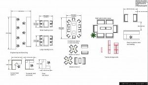
The first step is to define the staff and what they do and make an appropriate space allocation for each person and the backup or other areas they may use. The diagram above lists this and at the end of the diagram you will see a total space allocation and requirement that is directly related to the size of building or office space that the firm will require. This can either be done by the site audit of the existing staff and space or in conjunction with tables from data books such as New Metric Handbook Planning and Design Data. Simply put, this is the area allocated per individual.

For all involved in interior design this should be one of the major reference books used its an invaluable source of all sorts of basic planning information. If you don’t have it I strongly suggest buying it. It was one of my first purchases as a professional and I regularly buy the upgrades using the book for reference on a weekly basis. Its available here or from most good technical book stores. (prointeriodesigner.com does not have any affiliation to the book or its authors but we do receive a commission from the sale of it.)

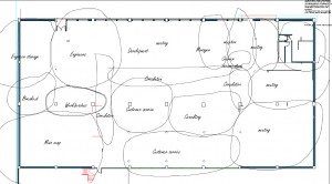
Having this information and in discussion with your client, the working relationships between the staff members and the groups they belong to are determined and drawn onto the bubble diagram What is a bubble diagram?

The groups are placed in relationship to each other at the same time drawing it onto an outline of the office space that they intend to occupy. This allows you  and your client to assess the layout before the actual drawing of rough spaces and then filling in the detail is undertaken.
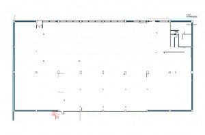
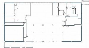
building outline for office planning interior design
Outline of building

 Click on image to increase size
interior design bubble planning an office

 Click on image to increase size
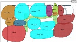
Coloring  the respective groups adds contrast and allows the client to start seeing the layout at a glance.

colored bubble diagram for office planning and interior design
Colored bubble overlay

Click on image to increase size
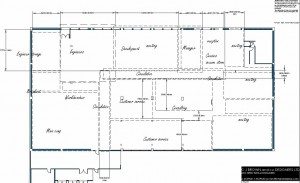
Then based on the information that you gained from the audit or existing office requirements survey you are able to rough out the space required for each group for office planning. This should start to be a fairy accurate representation of the spaces based on the those areas and your client will now be able to see the plan beginning to take shape.

layout for planning of a commercial office
The rough layout determining space to a scale

 Click on image to increase size
The construction of walls is a fairly permanent thing so add a rough draft of where they are likely to be situated takes place now. It starts to set the internal physical barriers and parameter in which each group is to be placed. This isn’t “set in concrete” as its still only a drawing but will give your design eye a very good indication of the space left.

office planning walls for interiodesign
Here the walls are placed

 Click on image to increase size

The furniture required for each person in this case was a standard desk and return. In 99 % of all offices this is the standard that offices work to. That’s why we see them in the show rooms at particular sizes and often in modules of 600 mm. (Bulk modern office furniture is usually made from laminate, melamine or veneer covered particle or mdf, medium density fibre board. These sheets are  usually 2440mm x 1220 mm or approximately 2740 x 1240 mm. The additional 40 mm being an allowance for tolerance and cutting) The modular size allows the use of the whole sheet with little wastage. Interestingly the sheet size seems to work worldwide and is based on anthropometric data and simple ergonomics and economics. Ever wondered why the standard ceiling height in a house is 2400mm and the standard size of plaster wall board is 2400x 1200 however that’s a whole other story.

So the size of the desk that we are working to in this situation is approx. 1800 mm x 800 mm although there is the option of 1700 mm x 800. This desk although slightly smaller than the 1800mm allows more desks in the larger space because of its size. Of course the desk is no cheaper because of the standard sheet size being used and cut down.
The meeting room tables and storage are all based on standard modules and allowances for circulation around them. As designers we often find ways of shortcutting the allowances by different layouts, still allowing the circulation but often with an amount of compromise because the client needs to fit in the additional person. You are able to do this with soft layout but care still must be taken for disabled access, fire egress and that all services such as ventilation heating and cooling are all complied with local regulations.

Interior design office furniture plans for space planning

 Click on image to increase size

So now it’s a matter of adding the furniture to the plan into the defined areas according to the relationships required by each group’s leader or the general manager. Take care here as office employee structures allow more say from each staff member. There will be those that will always want more or believe that they should have additional space or facilities and upset the whole plan. The manager needs to take this lead from you if an employee is compromising the design through selfish wants.

Having worked out roughly where each space is and having defined the space per person initially, then with the furniture allocated you must use your planning skills as a designer to start placing each individual with regard to communication and privacy. Screens may be an option and are a good way of cable management and getting power and data to the desks without the laying of cables on the floor or from above or having to be adjacent to a wall.

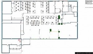
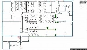
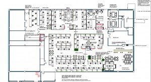
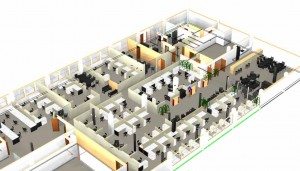
Below are a couple of plans with the furniture placed in stages and then the final layout and a three dimensional view of the final result. This is the basics for office planning, other articles will be added that cover detail to the services, furniture, lighting and a whole host of other aspects. Join the mailing list for notification.


Space planning an office interior design
The start of adding the furniture

 Click on image to increase size

The walls are in, we know the area allocated and we know the furniture sizing.

office planning interior design
Adding the furniture

 Click on image to increase size

Keeping the staff privacy and still being able to communicate

office space planning interior design
The finished office layout

Noting up the final layout

Office planning interior design office design
A 3D view of the office.

Happy office planning


Click here for a video of this article Space planning an office or watch below.


Nightclub planning

Living room planning 1

Bathroom planning 2


Written by Chris Brown

Color Consultant course