Theming a Cafe -Part 1
This exercise is demonstrated with a real life project. An existing food outlet in cafe form was to be sponsored by a company so that it was themed to represent the sponsor’s branding. It was to be tasteful and reasonably subtle but the user would be left in no doubt who the sponsor was. Unfortunately the business arrangement and politics that eventuated meant the cafe management opted to take a financial incentive rather than the revised refurbishment.
As for theming a cafe though, it was a valuable and interesting experience and design.
(Click on photo to enlarge)
Originally an architectural practice had been asked to undertake the development of the cafe on a generic basis. They did so to the brief but the cafe was quite clinical without any real ambiance or excitement in it. It appeared that the only thing that really kept it going was the fact that there was a captive market. Consequently the cafe didn’t perform as well as it should have and nowhere as well as it could have. This may have been the brief from the management but at the end of the day it did not do justice to what should have been a very professional fit out and high design standard not only for the customer but as an endorsement of the establishment itself. Enough of that though as it’s only the writer’s opinion and that is not the point of this article.
Theming a cafe is based upon using a universal theme and carrying it through so that it is reflected in the design without being crass. In doing so there are also planning requirements that should be considered and incorporated.
(Click on the photo to enlarge)
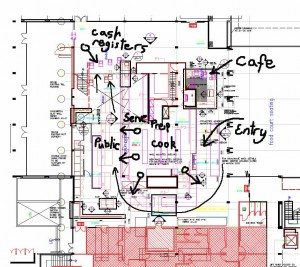
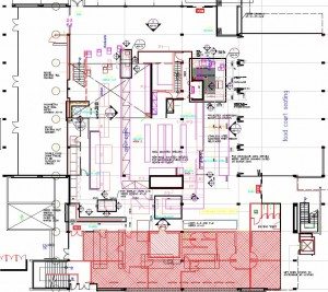
The first graphic (plan) demonstrates what is there. A system of producing food and beverage and then getting it out to the public with a system of selling the produce. It worked, but poorly. Areas had been split up and there was no flow through the public domain. Barriers everywhere and very little clear encouragement to buy. There was no excitement or enticement for the customer to inspire them or excite them into buying more or additional items that they couldn’t have known about unless the staff pointed it out. In other words it was only just functional and extremely boring. I spoke to the management about this and they agreed so the first part of my brief was about typical retail design.
(click on photo to enlarge)
Theming a cafe – what makes retail work?
- Get the customer to enjoy the user experience
- show them that they need the product
- get them excited about the interior, the atmosphere, and the produce
- make it easy for them to purchase and make a choice
- add value
Theming a cafe
In a nutshell that’s what selling is about and as a designer you are to help sell the product.
So to facilitate that first break down what is there. Diagram 2 has some rough writing showing the areas that could not be moved but did not work. An existing café, an entry to the main area totally unconnected, a difficult follow through, the central prep and cook that couldn’t be changed because of budget and how people paid.
(click on photo to enlarge)
(click on photo to enlarge)
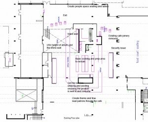
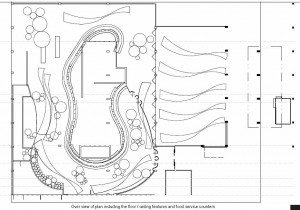
The second plan notes some of the issues and the start of ideas that may help create a space that was exciting and still functional.
So in developing the theme the brands appeared (and the product itself) to be very fluid. Fluid removes most barriers and the idea develop from there. If there were to be any barriers then they should be calls to action in the form of signage or graphics and even then they should only highlight the area not impede its flow of the space or customers. The same fluidity should be carried through the space three dimensionally, at eye height, above, at ceiling line and below on the floor and to the sides so that while the focus may be on the graphics and the product the peripheral vision was carrying the eye and the intent of the space in a certain direction. This was developed into the joinery and finishes.
The spaces had to be defined with purpose using signage and obvious purpose for the area ie the café,the selling areas and the dining areas.
(click on the photo to enlarge)
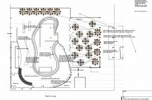
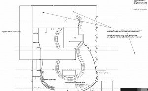
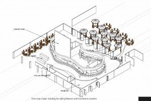
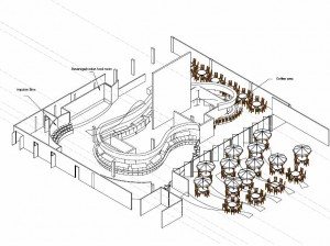
To the ceiling the circular lighting added bubble representation and to the floor and joinery a dynamic ribbon and the representations of such added to the theme. The point here is that a theme be it an Irish bar, a contemporary restaurant or a sponsor’s brand doesn’t need to yell at you but complement the interior so that its still attractive or novel without being overbearing.
The axonometric drawings demonstrate the ideas and the layout in three dimensional form and shows the client how it was going to work as a functioning retail store. It is referred to as retail in this instance rather than cafe as the business revolved around takeout food to the seating areas and the focus internally is on presenting product and facilitating the sale.
Continue with Part 2 of theming a cafe
