Cafe Theme – Part 2
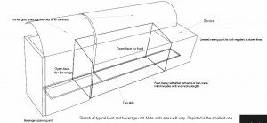
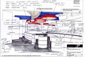
Developing the system further, a requirement from the sponsor was to have their product at the point of sale as well as a large back fed bottle chiller with an open face. The system developed was rather than a single or two point area for the cold beverages that each food station should have cold beverage available directly beside it. It increased the product exposure, allowed for convenience making it easy to get the “drink” when picking up food and also allowed for point of sale specials such as “this meal comes with this beverage” for a special price. Similar to a meal deal at many fast food chains. Each servery has a glass sneeze guard where graphics and lighting can be used to enhance the sales point. There is also a tray slide or area where handbags or other items the person may be carrying (in this case it could have been books or satchels as it was part of a university campus)
(click on the picture to enlarge)
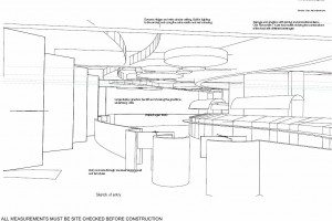
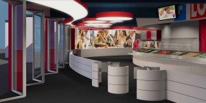
Theming a cafe – Below is an illustration of the developed entry to the cafe with security, the theme being developed and an idea of how it will flow and the point of sale fits into the servery line.
(click on the picture to enlarge)
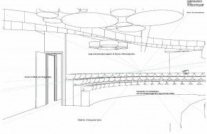
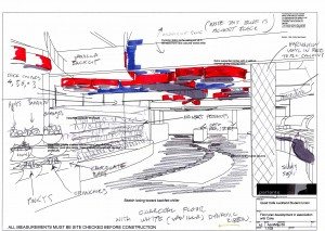
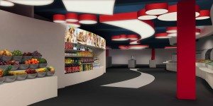
Further around the corner we can see an area for impulse bins where confectionery and fruit could be displayed and very easily accessed. This was quite different from the original scheme where these sorts of items as well as sandwich packs were simply placed in central table areas for the public to pick up. There was no specialized lighting or highlighting of the food available and the public simply took what was there with no enticement to purchase. Further theming of the sponsor is shown to the ceiling. Lighting within the circular shades and the sponsor’s color to the exterior all added texture and using red as all designers know is an old trick in hospitality to trigger hunger. If you refer back to the plan you will see that all food and beverage displays and public access are easily restocked from behind the counters or adjacent to the impulse bins.
(click on the picture to enlarge)
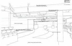
From this sketch the big back fed chiller is shown and ideas are able to be developed further with the theming required.
(click on the picture to enlarge)
The sketches that are chosen for full graphic development are chosen, and sketched over and noted for the graphics specialist to make a start on.
(click on the picture to enlarge)
(click on the picture to enlarge)
Theming a cafe – Finally the developed graphics are almost finished and are able to be given to the client as a precursor to final presentation of design, color boards and furniture. Promotional LCD TVs are used through out and are to be coordinated with the main projection screen to the atrium. Back lit poster displays are used to promote a positive emotion and are able to be changed readily as the company requires.
Still some graphic development to be added to the rendering but the theme is well on its way.
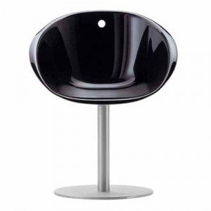
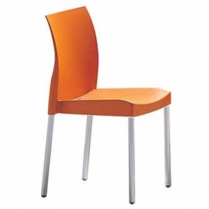
The renders shown here are not complete as the project was stopped after the cafe took another option from the sponsor rather than redevelopment, however its fairly clear to see what the outcome was going to be. The chairs and furniture were all carrying the same feeling of a modern café with a fluid and slick feel to it to appeal to the younger patronage that the café had.
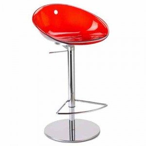
Cafe bar stools
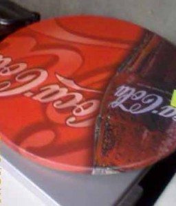
and finally the table tops. Perhaps this was the sponsor perhaps not.
I hope this provides you with a good example of how to theme a cafe and the process it takes to create a good retail environment.
